Sustainable living app promoting reuse and waste reduction through community-driven solutions
Our project was a collaborative effort between multiple team members with specialized roles:
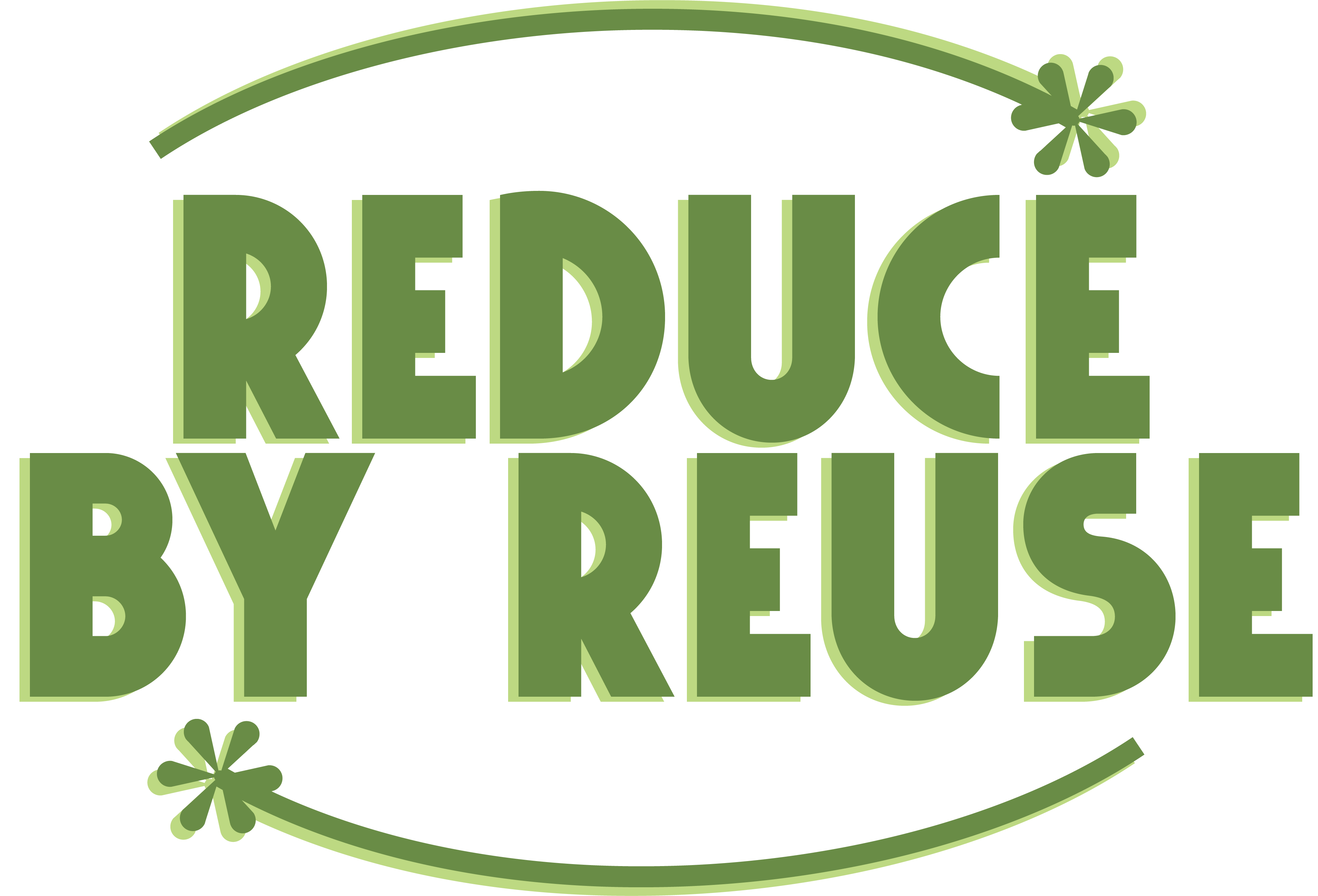
For this project, I redesigned the UX for the Reduce by Reuse mobile application. I focused on optimizing efficiency based on user input.
At first we wanted to work with CU Boulder to have a website that is directly linked to some part of CU's website. We created design systems and wireframes based on CU's. However, with much effort to get in contact with them and work with them, we were unsuccessful. We then decided to scrap our original idea and go rogue--making a design system and website we actually like.
To start our work with CU, we reached out to CU's Distribution Center. We worked with them since it was hard to get into contact with anyone at CU. However, even though this CU branch was mentoring and guiding us, they also had pushback and lack of communication from CU.
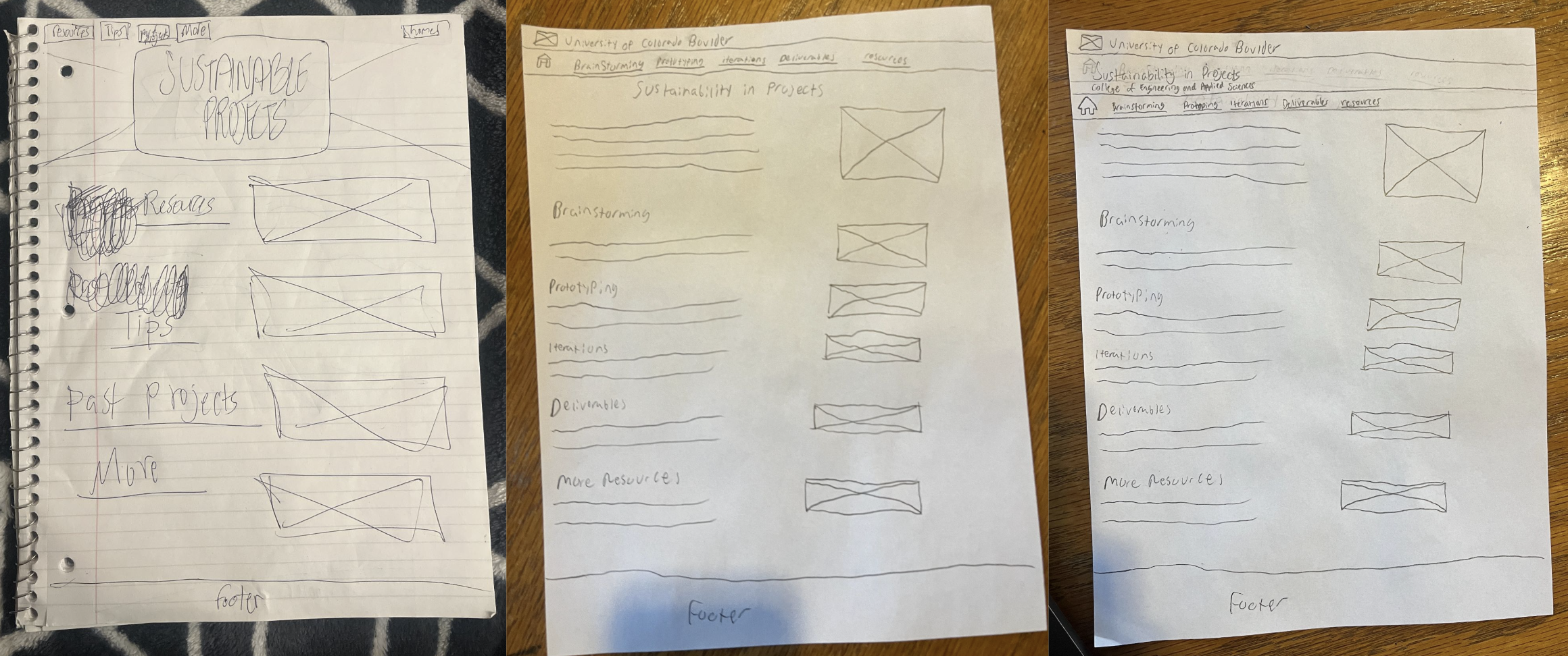
We followed CU design's system closely and created wireframes.
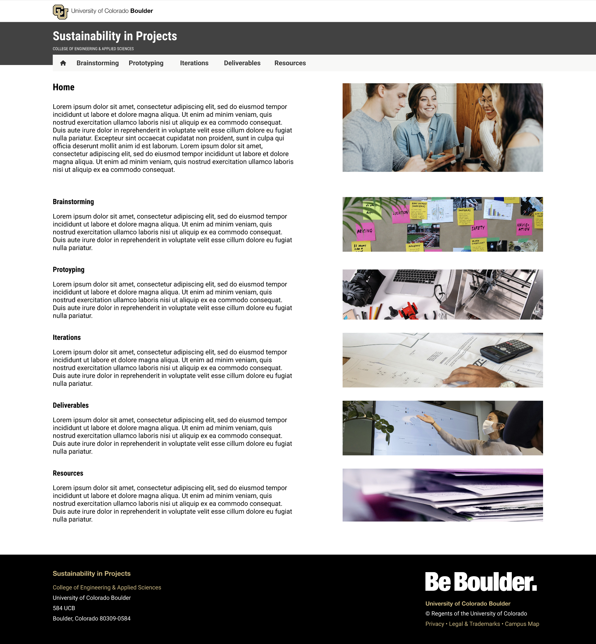
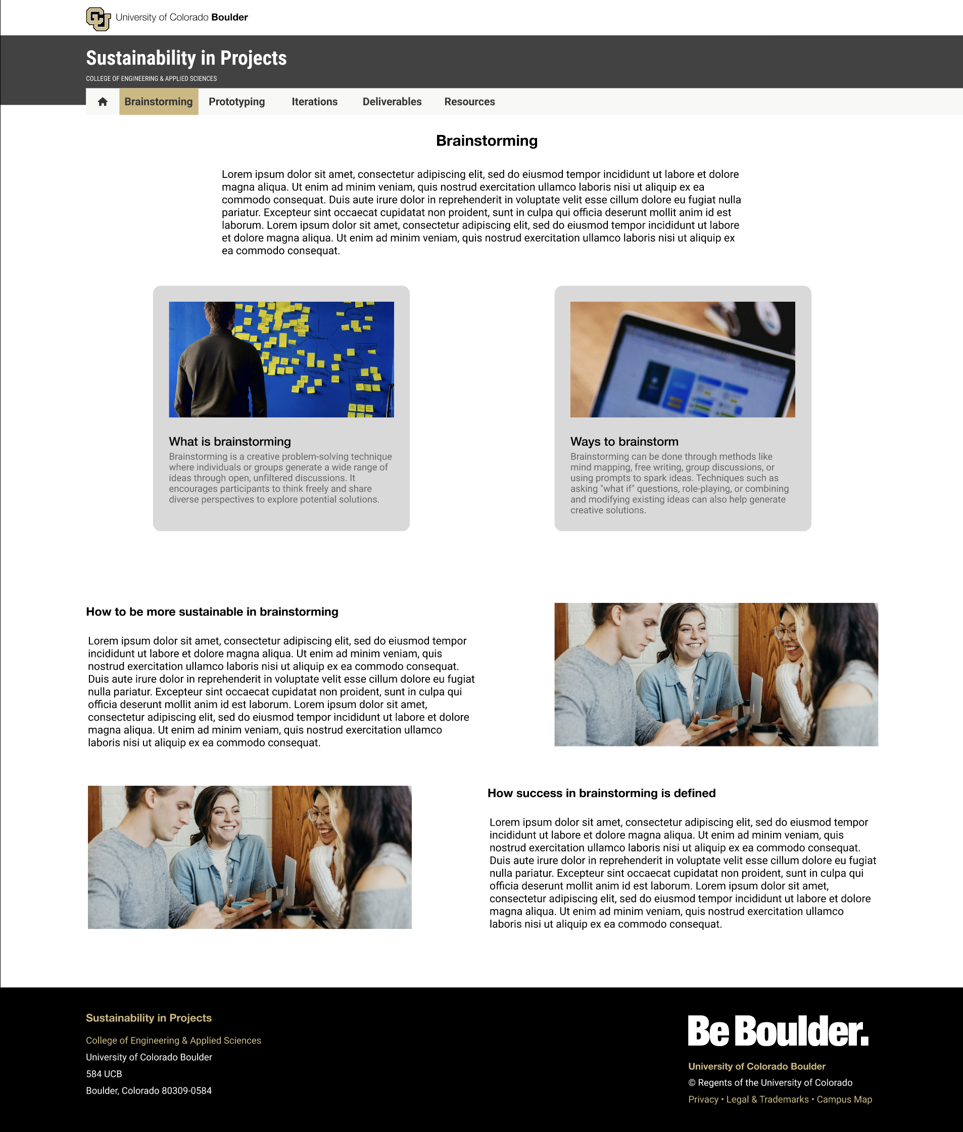
After several weeks of no actual motion of our website being integrated on CU's main website, we decided to go rogue and do our branding.
Many people struggle to find sustainable ways to dispose of items they no longer need, while others are looking for affordable alternatives to buying new. Traditional donation methods can be inconvenient and lack community connection.
I designed an intuitive mobile app that makes it easy for users to post items they want to give away, browse available items in their area, and connect with their community. The app gamifies sustainable behavior through rewards and achievements.
• Easy item posting with photo upload
• Location-based item discovery
• In-app messaging for coordination
• Sustainability tracking and rewards
• Community challenges and events
The app concept addresses the growing need for sustainable consumption patterns and community connection. User testing showed high engagement with the gamification elements and positive feedback on the intuitive interface design.
Working alongside Warren Goodell, I helped create an intuitive, accessible, and visually engaging user experience for our project.
We conducted user interviews and surveys to understand our target audience, creating detailed personas that guided our design decisions. This research revealed key pain points and opportunities that shaped our approach.
View User Research & InterviewsI developed the site structure and user flows, creating low-fidelity wireframes that established the foundation for our interface design. This involved multiple iterations based on team feedback and user testing.

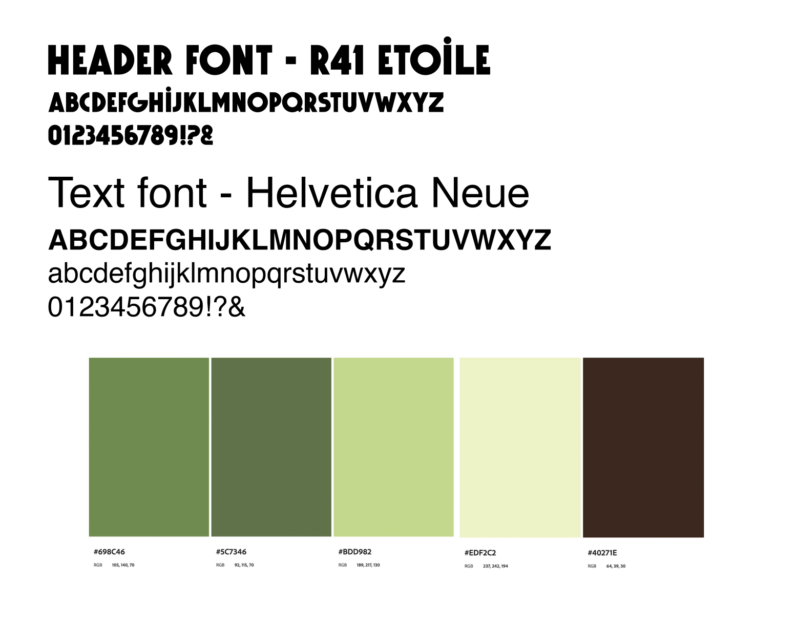
I created a comprehensive design system including typography and color palette. This system ensured visual consistency while accommodating accessibility requirements.
I developed interactive prototypes in Figma and conducted usability testing sessions, analyzing feedback to refine the design. This iterative process helped identify and resolve usability issues before development.
I developed and implemented marketing strategies to effectively promote our project, creating cohesive brand materials and communication channels.
I created a distinctive brand identity including logo, color scheme, typography, and "vibe". I was able to start this with marketing research. I did research on which students do the most physical projects and what major and building they are in.
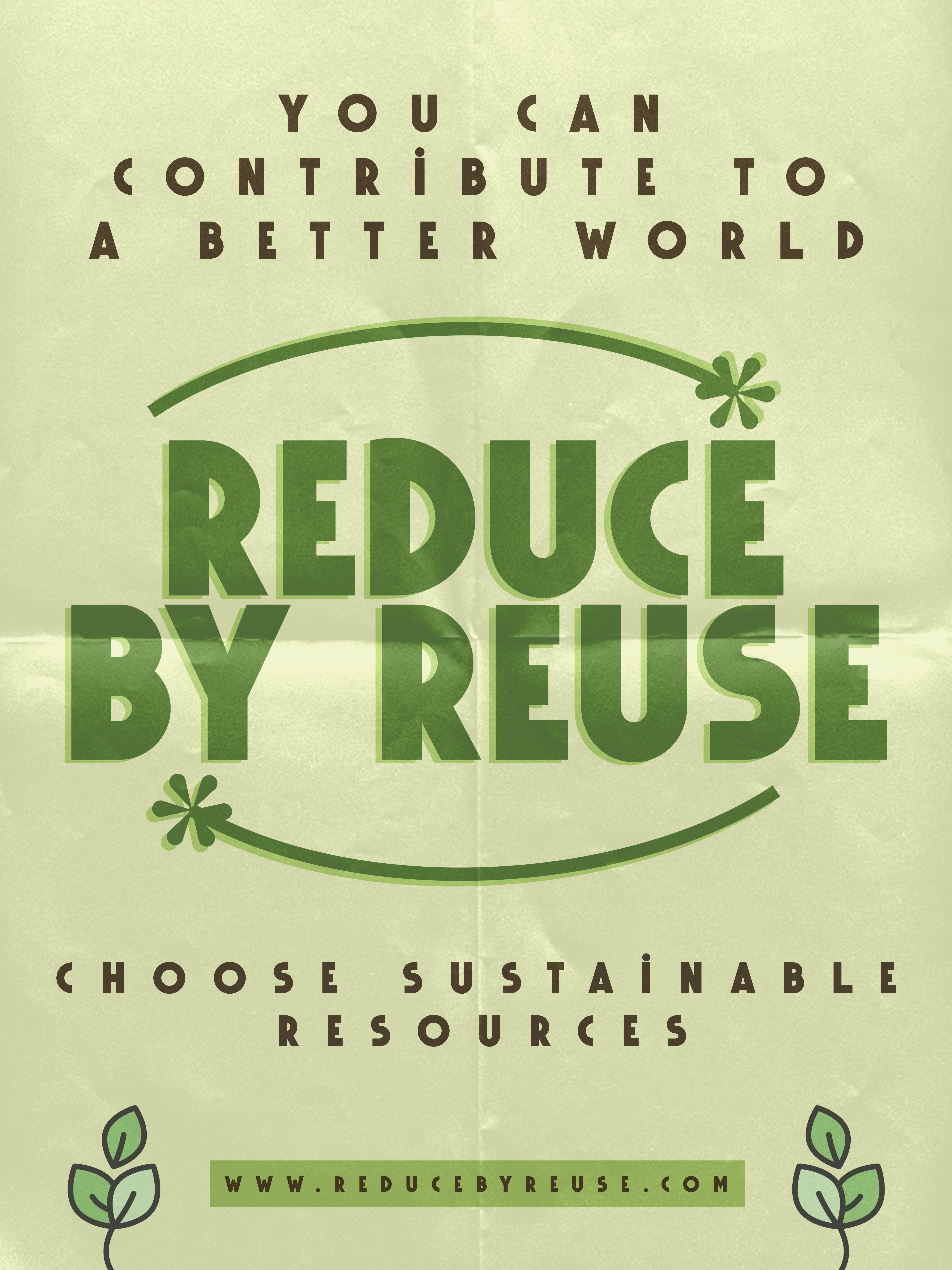
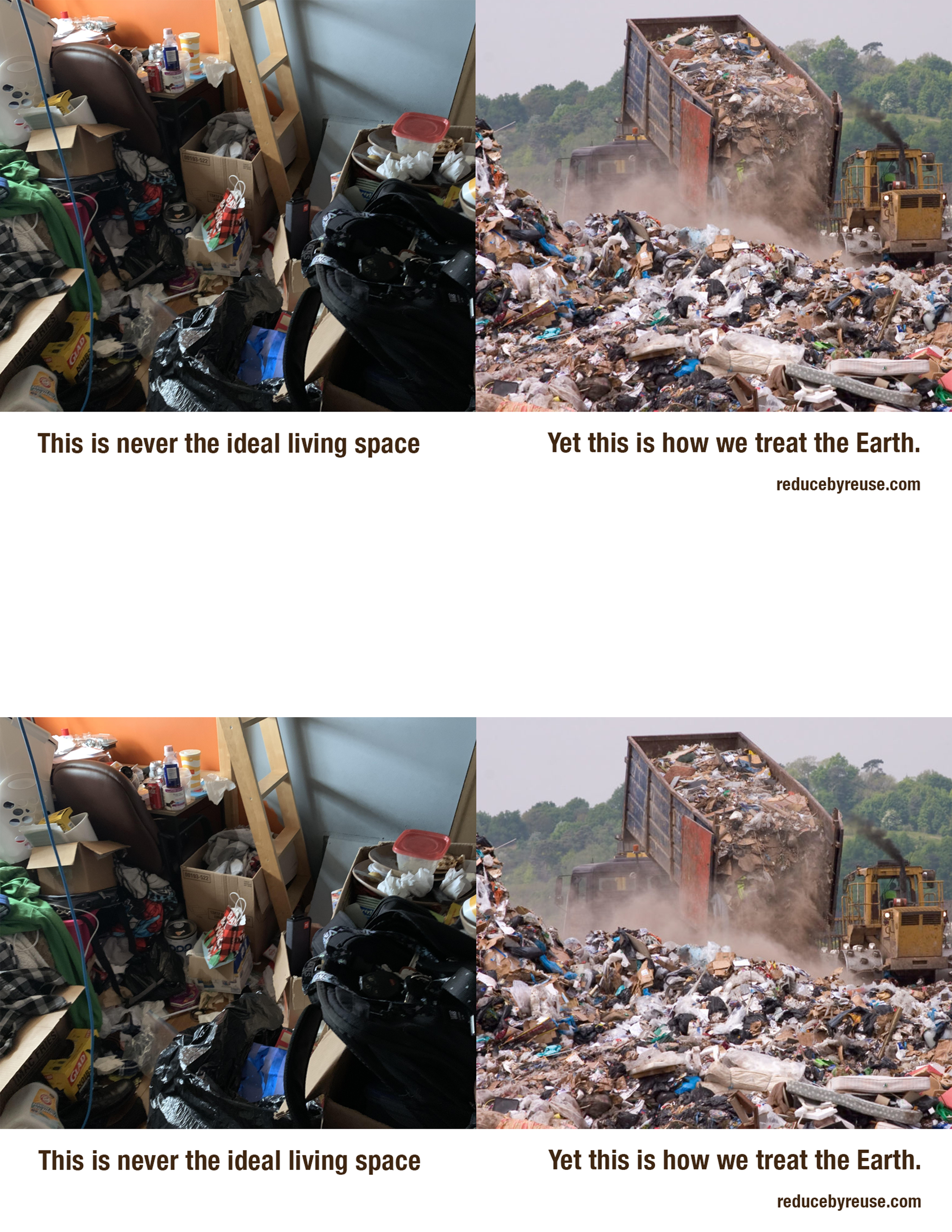
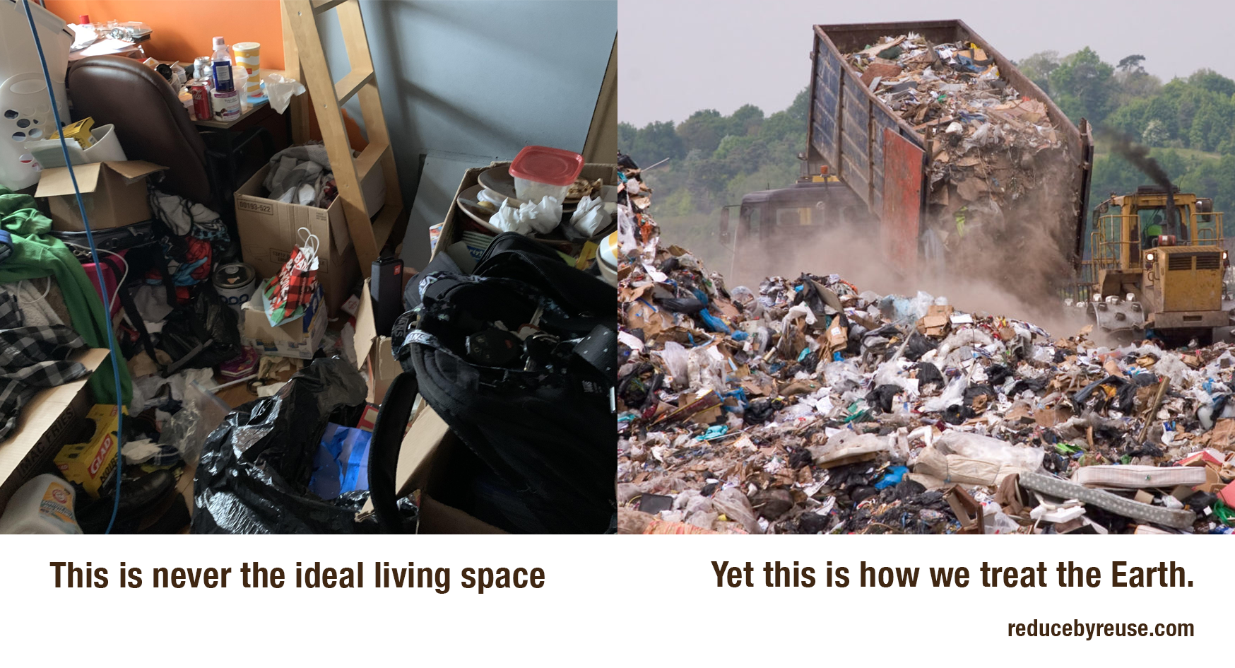
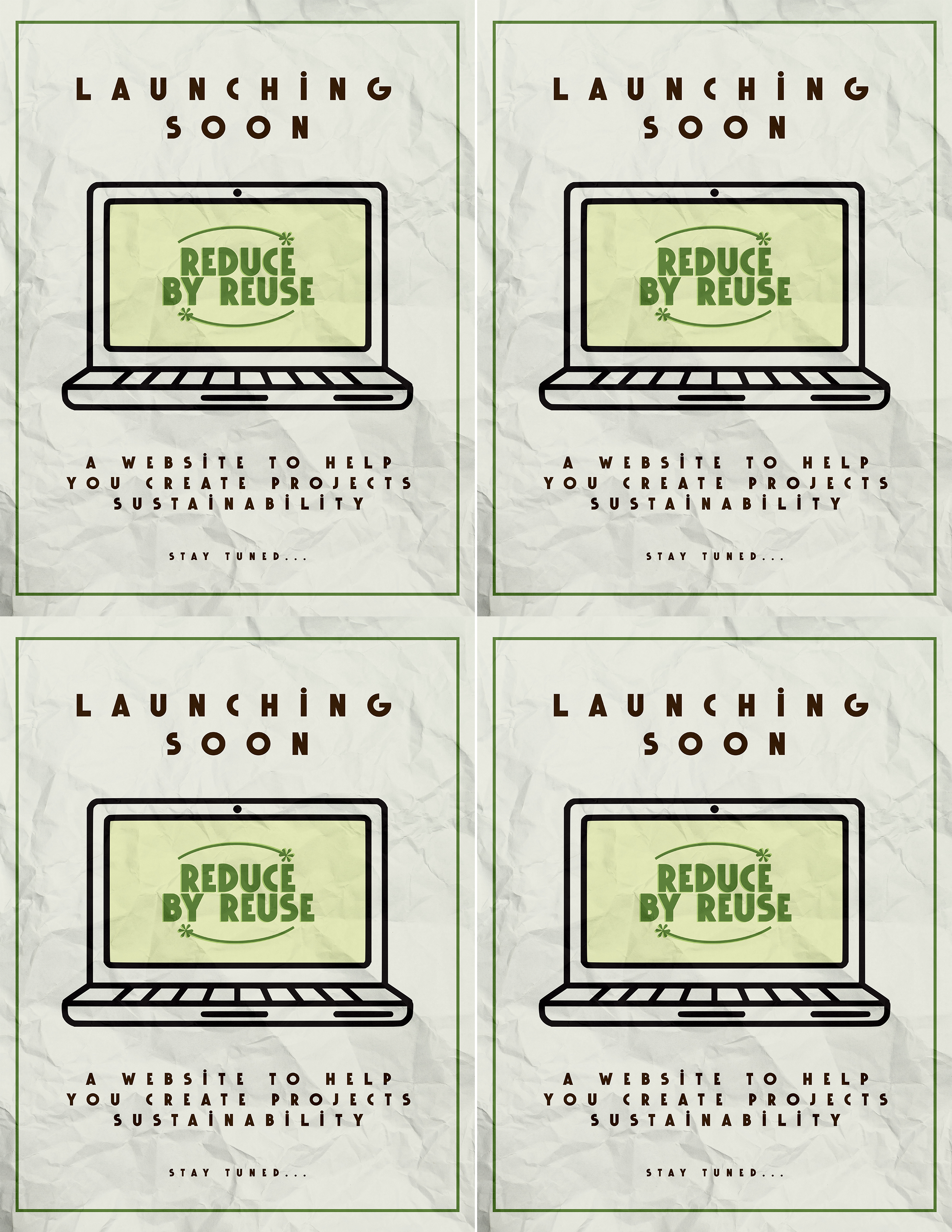
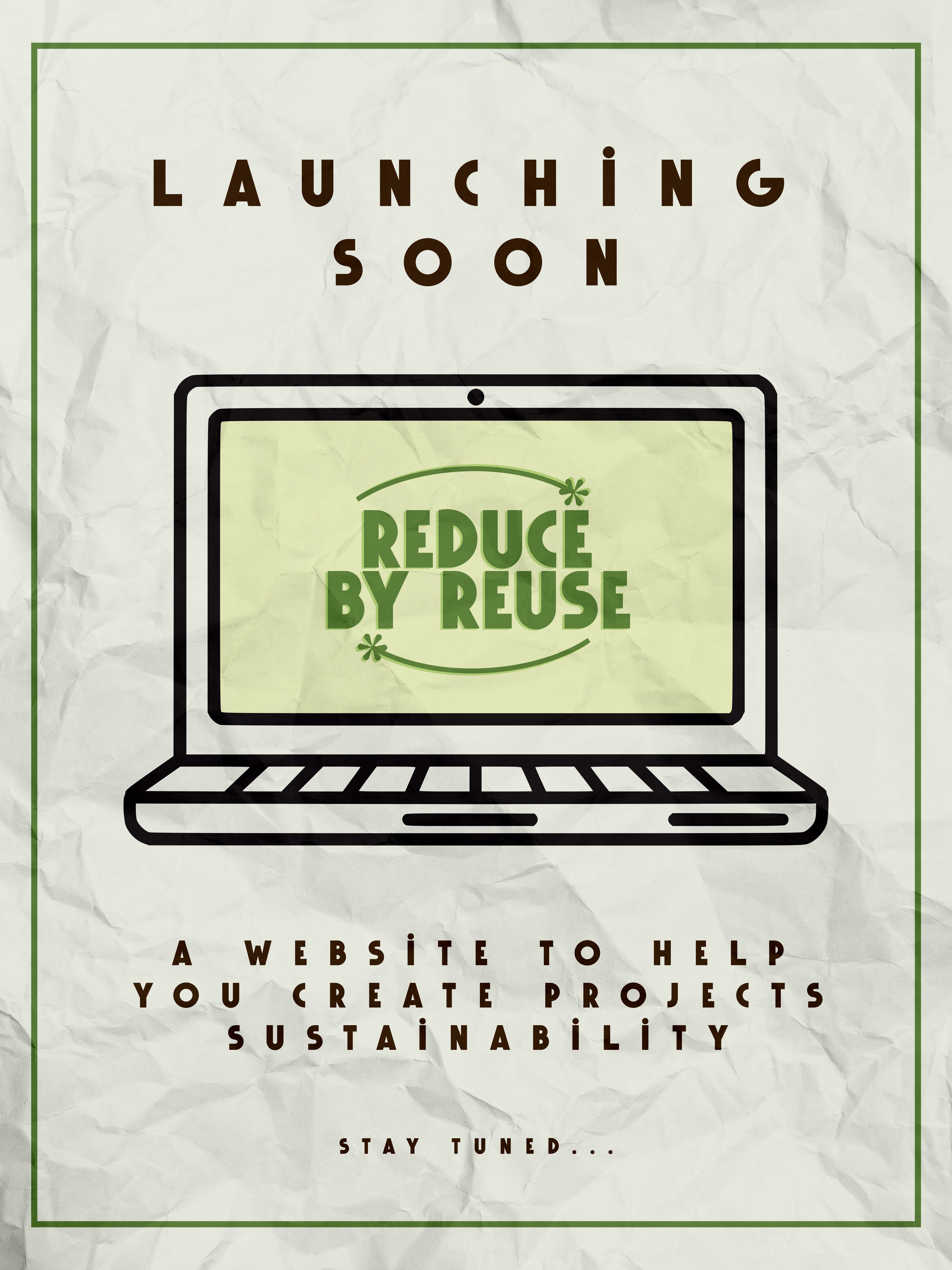
I designed promotional materials including posters. These posters effectively communicated our project's value proposition and core features. I placed them on campus, in the places where students do the most projects.
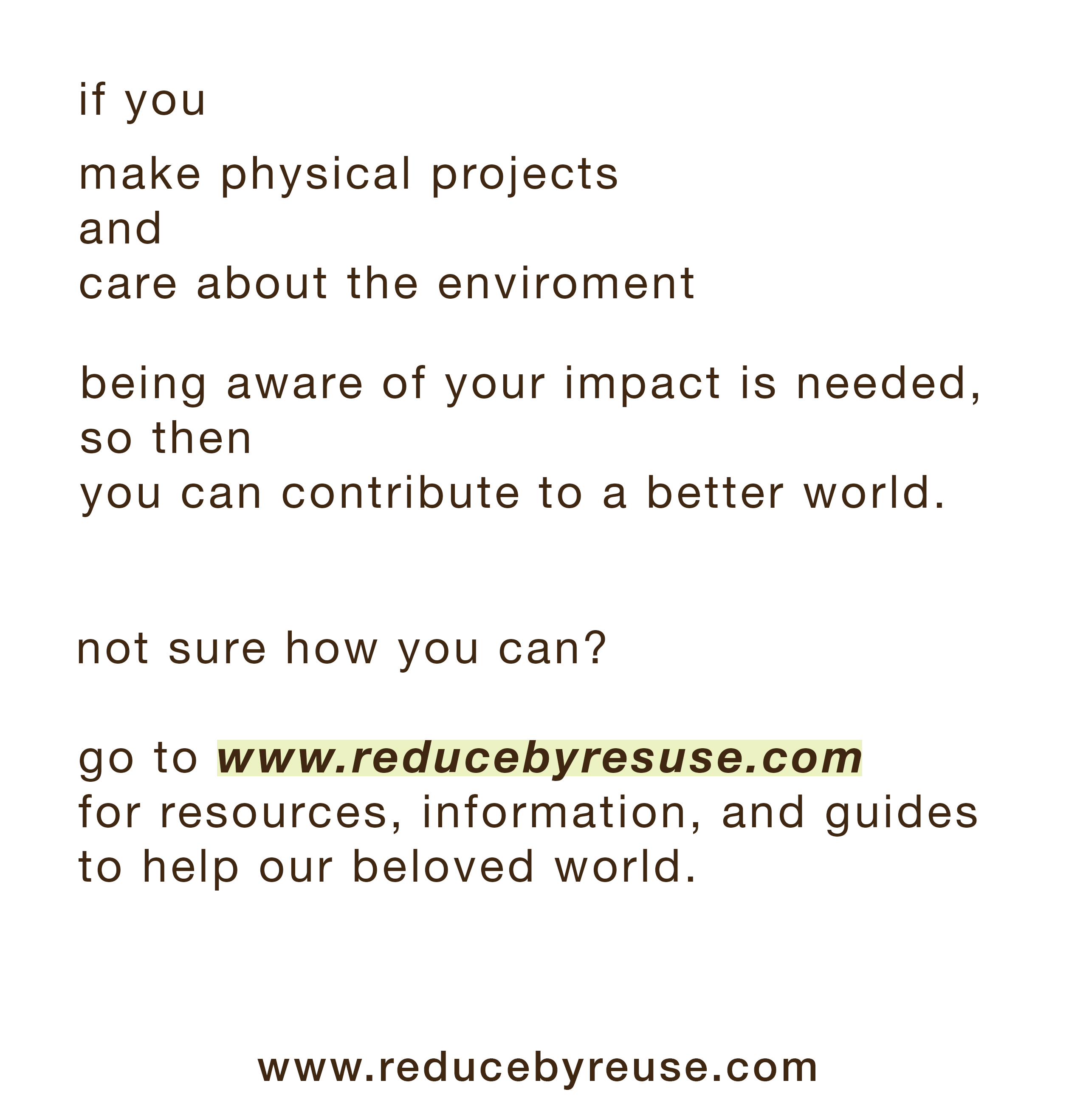
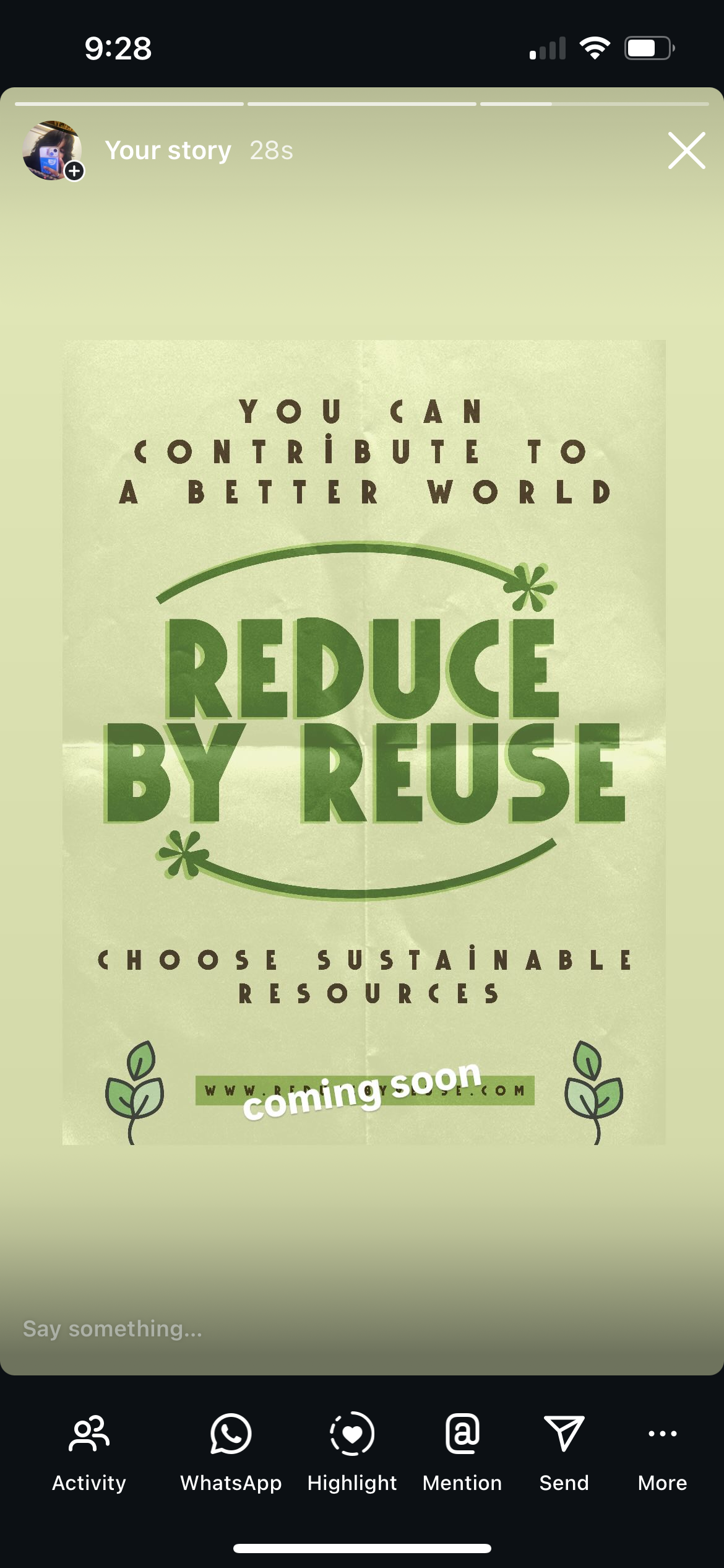
I posted on my social media (as I have many environmental enthusiasts and engineering people following me) about our website.
The last thing I did was animate an explainer video about our website. This was done on primarily After Effects.
View Animation ProjectThroughout the project, I created and delivered presentations documenting our progress and findings.