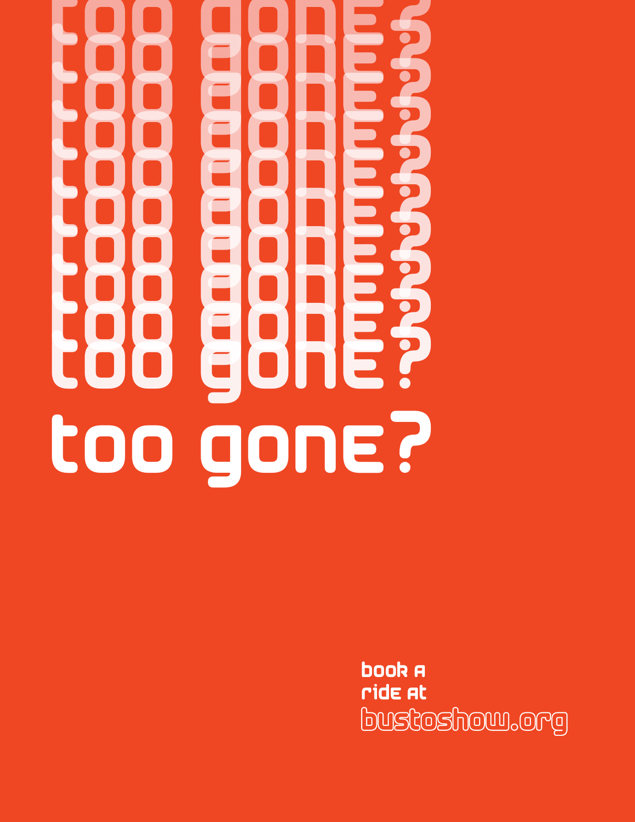

Informational poster series designed to guide and inform audiences


The Bus to Show informational poster series was designed to provide clear, accessible information to audiences in a transportation context. These posters combine functional information design with engaging visual elements to ensure effective communication.
Creating informational materials that work effectively in a transit environment requires balancing clarity, readability, and visual appeal. The posters needed to communicate important information quickly to people in motion.
I developed a cohesive visual system that prioritizes information hierarchy and legibility. The design uses bold typography, clear iconography, and strategic color coding to organize information and guide the viewer's attention.
• High-contrast typography for readability
• Intuitive iconography system
• Strategic use of color for organization
• Scalable design for various formats
• Accessible design principles
The poster series was designed to work across multiple touchpoints, from large-format displays to smaller informational materials. The flexible design system ensures consistency while allowing for adaptation to different contexts and information needs.