Streamlining the ticket purchasing experience for zoo visitors

For this project, I redesigned the UX for the Denver Zoo's ticket system. I focused on optimizing efficiency based on user input.
The Denver Zoo ticket system needed a complete redesign to address visitor frustrations with confusing pricing, complex navigation, and lengthy checkout processes. This project focused on creating a streamlined, family-friendly experience that would reduce purchase time and improve overall visitor satisfaction.
Before I began the process on Figma, I conducted multiple user tests which tested the current ticket system. I evaluated what made the user mad, happy, and satisfied. I wanted to get rid of whatever made the user unsatisfied with the experience. This was mainly the amount of pages you had to go through.
I analyzed 3 zoo websites comparing the UX.
How might we reduce the amount of pages while maximizing efficiency for the user?
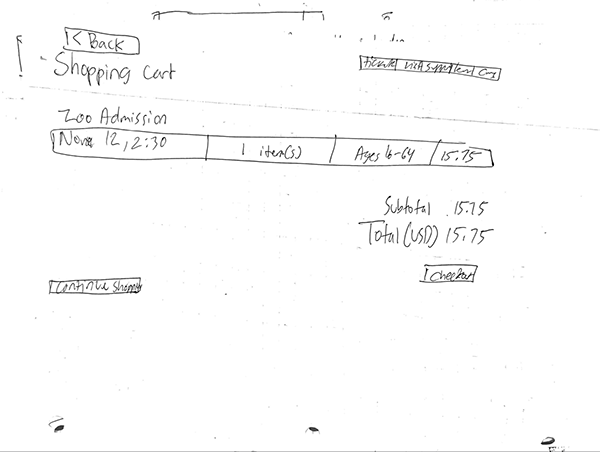
Users need less pages for the add-ons because it is tedious and made users mad.
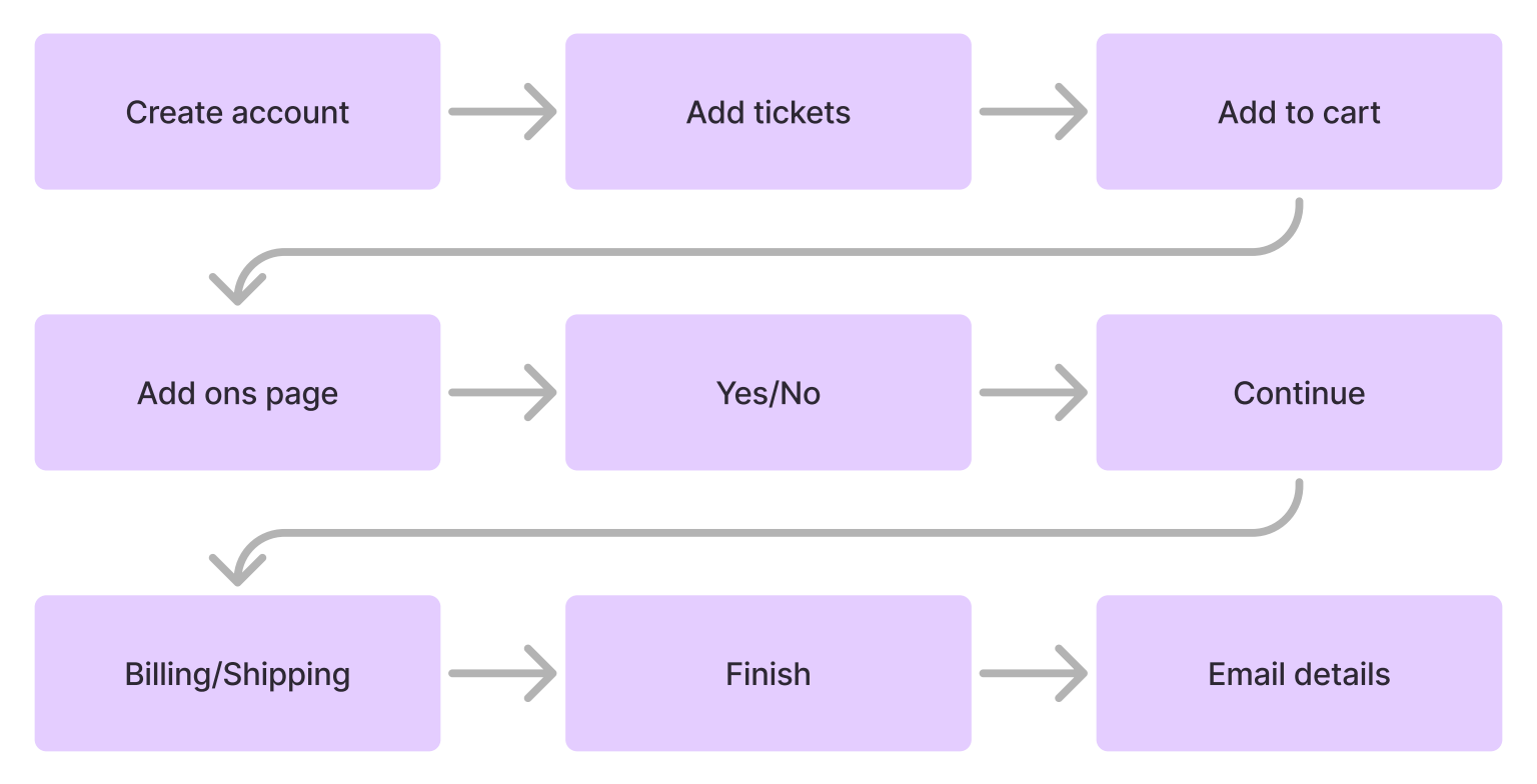
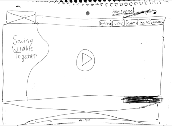
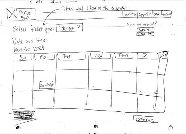
I created low fidelity wireframes that gave a rough idea on how I want to reduce pages.
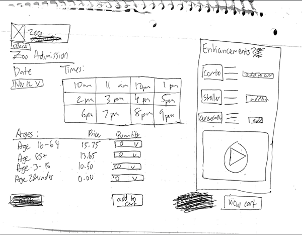
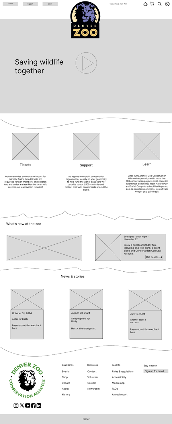
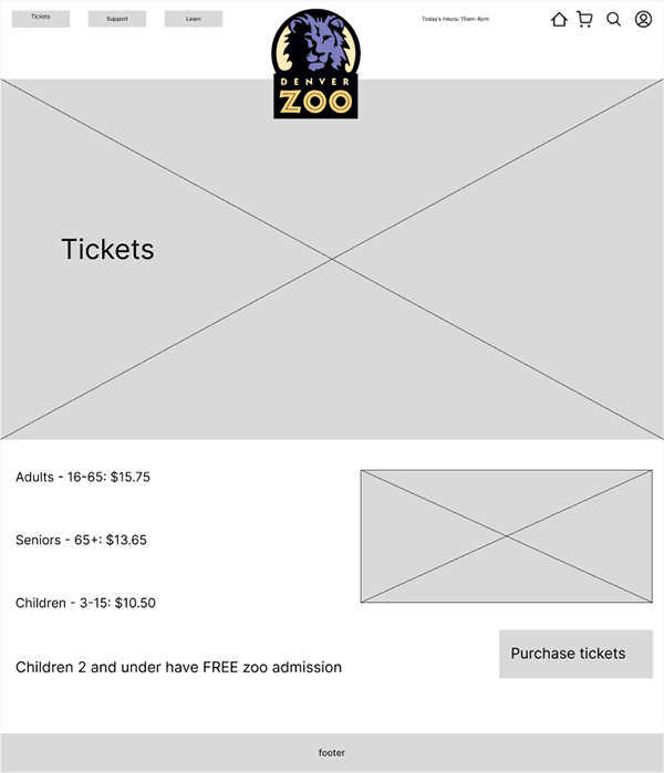
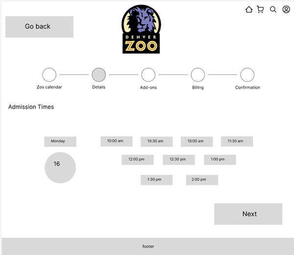
After testing my mid fidelity numerous times, I made a better version that optimizes functionality and design.
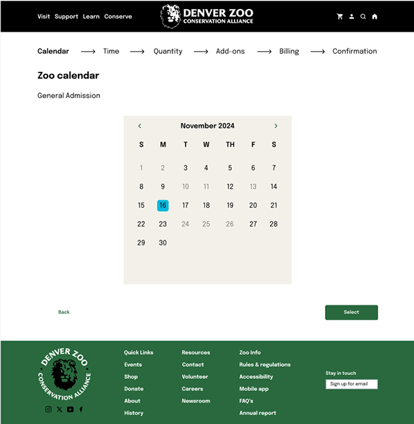
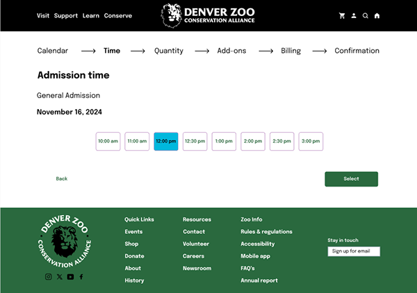
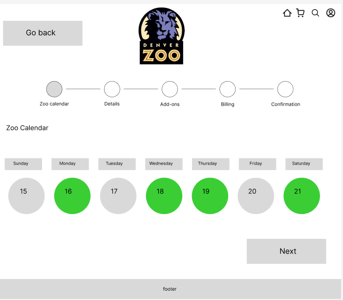
I tested 3 people using my first iteration of high fidelity with a rough prototype. I wanted to make sure my problem statement was solved, as well as weed out issues I didn't spot. I found that not having a clear "buy tickets" button was a problem and that the calandar page system seemed tedious.
To fix these issues, I added a large button on the homepage labeled "buy tickets". I also changed my calendar system from a scroll to an actual calendar view.
My next steps would be to find another case. This is my first official UX project so I plan to bring these fresh skills to my next project. In the future, I will probably do UX faster as I have some experience now.
I learned so much doing this project. All the UX guidelines and tips are big takeaways. I also learned time management a little better with this project.